Fun, never childish
Joy with taste. Playful enough to spark curiosity, disciplined enough to feel intentional.
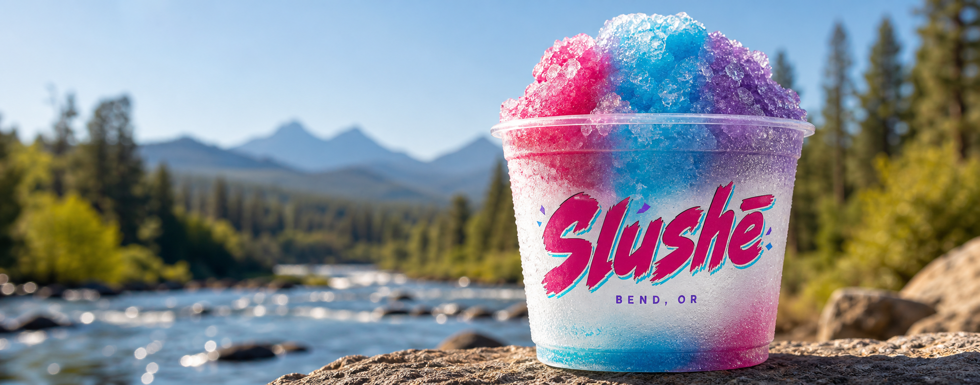
Frozen shaved ice • Summer in Bend
A bright, rough-edged identity built for high-desert heat, mountain-town energy, and the perfect shaved-ice pause.
Explore↘Brand character
Slushē should feel like the first cold hit after a dusty trail: immediate, electric, and ridiculously refreshing.
Joy with taste. Playful enough to spark curiosity, disciplined enough to feel intentional.
High-voltage color lands in focused moments. Quiet fields give the energy somewhere to go.
Bend-born and active without leaning on mountain clichés, snowflakes, or souvenir-shop language.
A dry-marker edge, a little forward motion, and just enough attitude to stay memorable.
Visual system
Pure white replaces warm cream as the primary quiet field. Translucent planes, crystalline grain, and chromatic edge shadows add dimension without softening the dry-marker attitude.
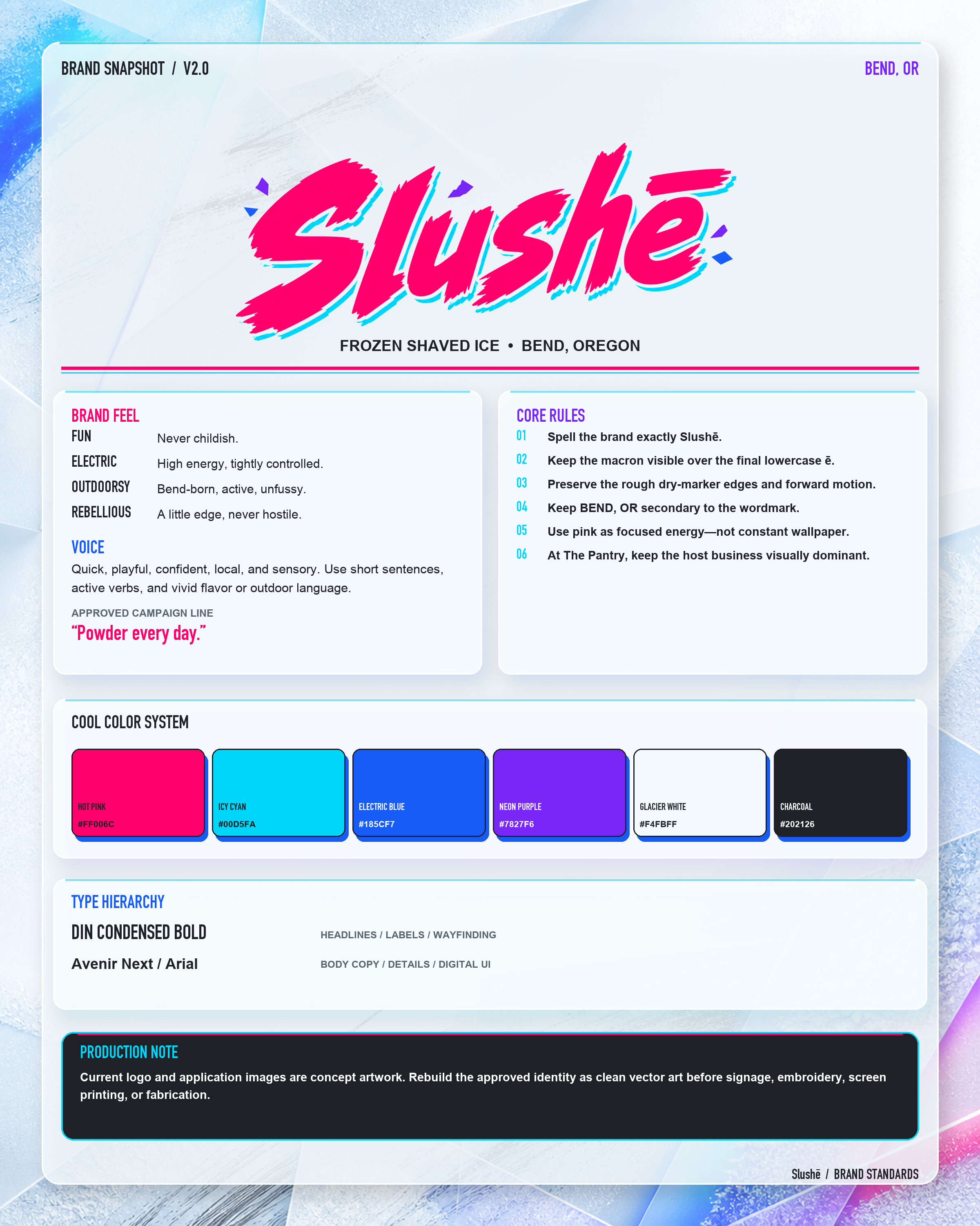
Display / DIN Condensed Bold
Body / Avenir Next
Logo discipline
Spell the brand exactly Slushē.
Keep the macron visible over the final lowercase ē.
Preserve the rough dry-marker edges and forward motion.
Keep BEND, OR secondary to the wordmark.
Use pink as focused energy—not constant wallpaper.
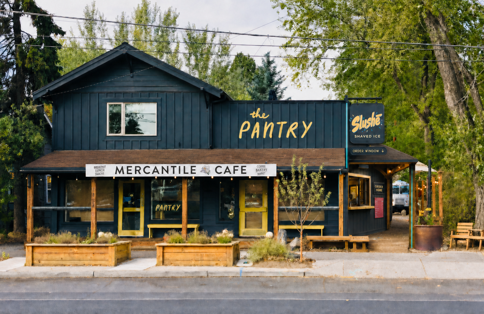
At The Pantry, keep the host business visually dominant.
Voice & messaging
Quick. Playful.
Confident. Local.
Sensory.
Slushē speaks in short, vivid bursts. The voice feels like a mountain-town friend who knows the best line, the best flavor, and when not to overexplain.
The system in the wild
Merchandise can carry more attitude. Campaigns can turn up the color. At The Pantry, the host identity always stays visually dominant.
Mobile brand / Food truck
Chase the chill.
The truck is the brand at full volume: a moving billboard, service counter, and bright landmark in one. It stays unmistakably Slushē rather than becoming a separate sub-brand.
Hot-pink wrap makes the truck recognizable from a distance.
Cyan framing turns the service window into the action zone.
Oversized wordmark owns the broad side elevation.
White utility panels hold menus, permits, and rotating messages.
Find the pink truck. / Next stop: ___ / Chase the chill.
Application imagery is concept artwork. Confirm copy, dimensions, materials, site conditions, and production tolerances before fabrication.
Brand library
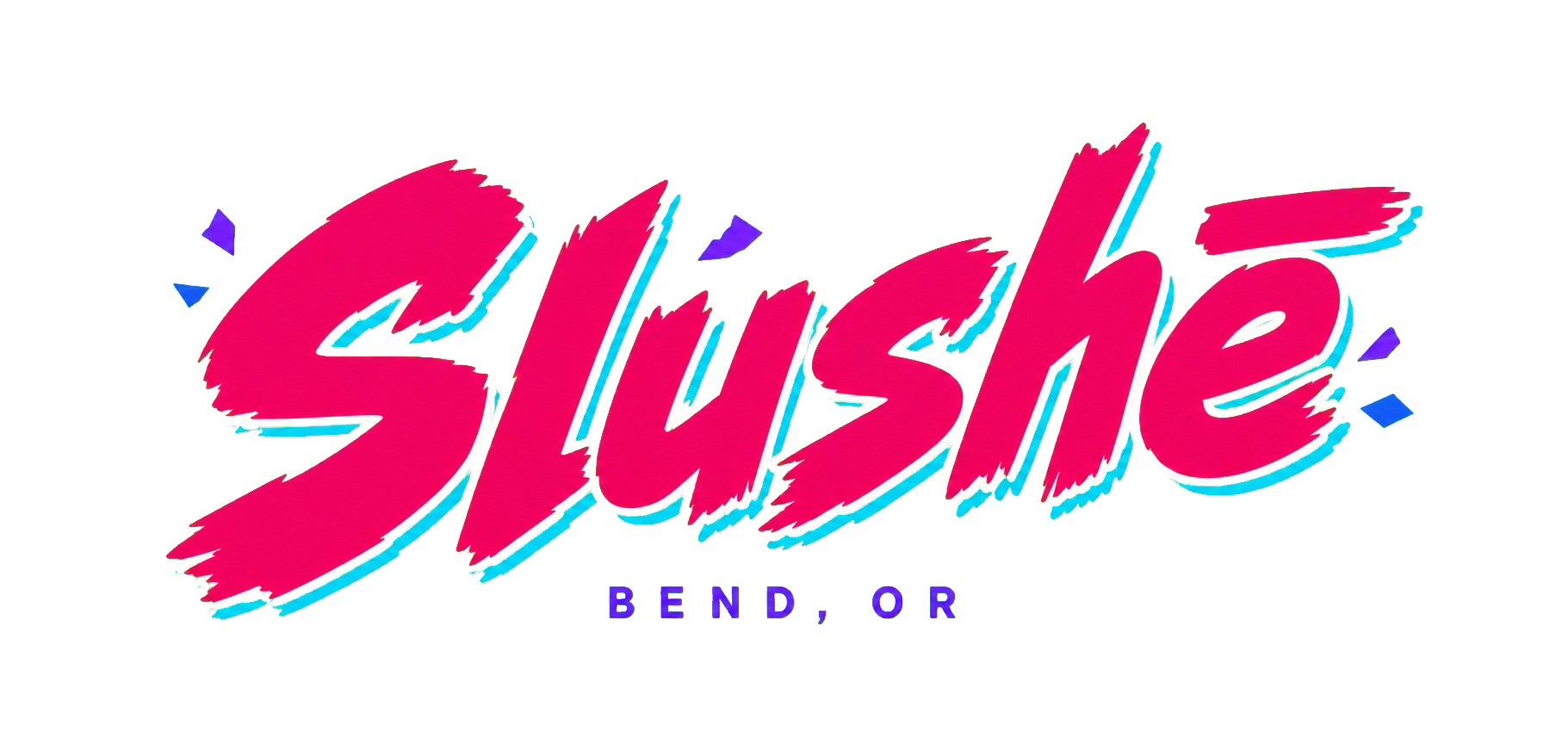
Start with the quick-reference sheet or go deeper with the complete working guide. Use the supplied BEND, OR lockup as the approved digital logo while the production vector artwork is refined.